| Table of Contents |
|---|
Introduction
Use the Graph tab to change graph appearance and perform operations on graphs.
...
The Y-axis scale can be altered using the Y-Axis Scale sliders. Scaling is an important issue to consider when viewing expression values because the distribution of these values across the range defined by their minimum and maximum may be highly asymmetrical. For example, the majority of values could range between 100 and 1,000, with just one or two percent exceeding 100,000. These extremely high values (relative to the rest) would tend to dwarf the others if displayed to scale because the vertical axis would be forced to show a range of 1 to 100,000. Although technically accurate, such a graph would not be very informative because most of the information – the relative differences in value between different base pair positions – would be impossible to discern visually.
Setting minimum and maximum bounds By Value allow the user to set the cut-off values based on the actual Y-axis number. This does not take into consideration where most of the actual data lies. By Percentile offers thresholds defined by the actual percentage of data. For instance, using our theoretical 1 to 100,00, if you set By Percentile with Max: 90, and 90% of your data is below 1000, the Y-axis range would run from 0 to 1000. Any extreme values that are above or below the chosen thresholds are truncated from the display, and the values in between are displayed across a range that allows their differences to be noted.
To set these visible bounds, use the Y-axis scale section of the Graph tab:
...
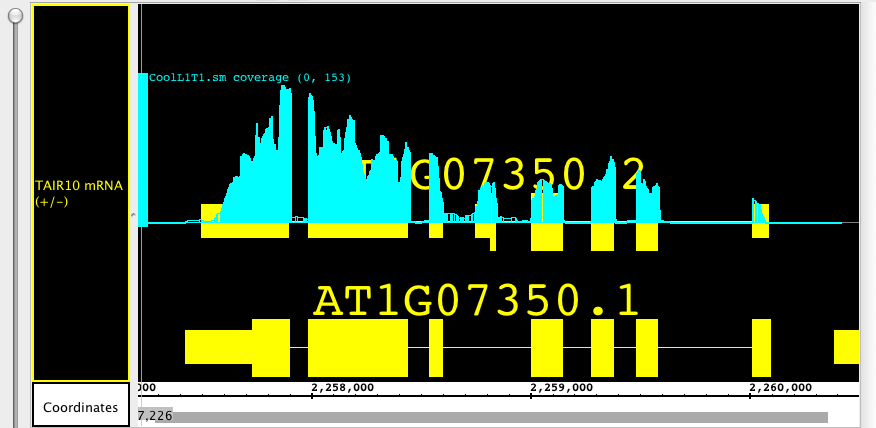
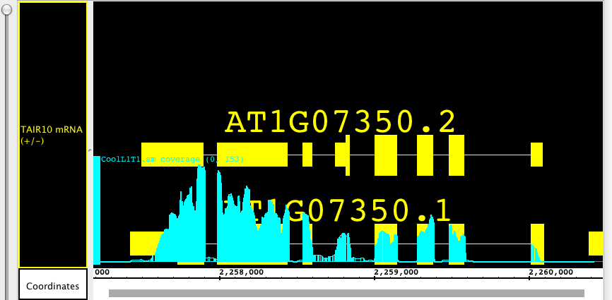
To move or select a floating graph, click the graph-handle. In the pictures below you can see how the floating graph can be moved to overlay two different gene models, showing the alignment of exons and introns with the depth graph (.wig) from a next-generation sequencing experiment.
Change the height of a graph
...
- Bar -- Individual values are shown as vertical bars that are one base wide for position graphs and of variable width for interval graphs.
- Line -- Subsequent values are linked with a line. Even if the input file was not sorted, the values will be connected in order along the genomic coordinate axis.
- Dot -- Shows a single dot for each data value. For interval graphs, horizontal lines will be connect the start and end points.
- Min/Max/Avg -- This is the default style for most graph data types and is usually fine for most purposes. It is especially useful for showing very densely populated graphs with data points for large numbers of positions. When IGB is zoomed all the way in, the display is equivalent to the Bar style. When zooming out, IGB starts to summarize values. When the scale of the display reaches the point where individual x-values are associated with multiple score values, IGB picks the maximum and minimum values and draws a vertical bar between them. In addition, IBG IGB draws lines through the average of all the data points represented at each x value.
- Stairstep -- Similar to the bar graph style, except that bar widths along the horizontal axis are stair-stepped. For example, if position 100 has a value of 50 and position 200 has a value of 75 and there are no values in between, then IGB will draw a bar of height 50 that starts at position 100 and stops at position 200. Then, at position 200, IGB will draw a new bar of height 75 that terminates at the next location with a value. This style is particularly useful for viewing .egr and .sgr files, ESTs, or other high-density data.
- Heat map -- Instead of showing relative intensity via the height of the line at each pixel or coordinate as in most other graph styles, a heat map shows expression levels via color or brightness of the line at each pixel or coordinate. This graph style is useful if you want areas of greater expression to jump out at you. If a graph does not render or is hard to see, adjust the visible bounds of the graph until features are readily visible. Several heat map color maps are available to choose from. Transparent color maps are available and may be useful for floating graphs.
...