Use the Graph tab to change graph appearance and perform operations on graphs.
Graph tab in IGB 7

Most graphs are similar to the annotation tracks; you can modify many properties of graph tracks in the same way you modify properties of annotation tracks.
To change Right-click on the track handle and choose from the menu. See Customize track appearance. Floating graphs do not appear in such a track. Settings and adjustments that are specific for graphs can be made using the Graph tab; to enable most of these options, a graph track must first be selected.
To change the settings for one or more graphs that are displayed in IGB:
Any changes you make to the values in the Graph Adjuster panel will apply to all currently selected graphs.
You can show the track name, and y-axis min, max on graphs by checking the Label option in the Manipulations panel.
You can set the Y axis to be displayed by checking the Y Axis box. The axis markings will appear at the left side of the track.
The Y-axis scale can be altered using the Y-Axis Scale sliders. Scaling is an important issue to consider when viewing expression values because the distribution of these values across the range defined by their minimum and maximum may be highly asymmetrical. For example, the majority of values could range between 100 and 1,000, with just one or two percent exceeding 100,000. These extremely high values (relative to the rest) would tend to dwarf the others if displayed to scale because the vertical axis would be forced to show a range of 1 to 100,000. Although technically accurate, such a graph would not be very informative because most of the information – the relative differences in value between different base pair positions – would be impossible to discern visually.
Setting minimum and maximum bounds By Value allow the user to set the cut-off values based on the actual Y-axis number. This does not take into consideration where most of the actual data lies. By Percentile offers thresholds defined by the actual percentage of data. For instance, using our theoretical 1 to 100,00, if you set By Percentile with Max: 90, and 90% of your data is below 1000, the Y-axis range would run from 0 to 1000. Any extreme values that are above or below the chosen thresholds are truncated from the display, and the values in between are displayed across a range that allows their differences to be noted.
To set these visible bounds, use the Y-axis scale section of the Graph tab:

To display the full range of the data, choose By Percentile and set the Min to 0 and Max to 100.
In the Options panel, check the option Floating. By selecting this option, the graph track becomes 'disengaged' from the track framework. This allows a graph track to be moved any where (vertically) within the main image, AND overlay whatever it is placed over. By placing this quantitative track (graph) over or nearer to annotation tracks, you might find it easier to understand and analyze the data. If the graph is floating, you can change it's height by holding down the shift key and dragging your mouse up or down on the colored bar at the left end of the graph (this block is the 'graph handle').
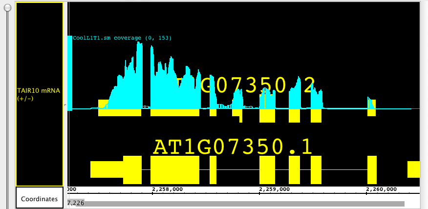
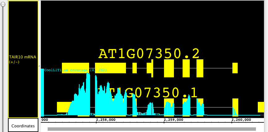
To move or select a floating graph, click the graph-handle. In the pictures below you can see how the floating graph can be moved to overlay two different gene models, showing the alignment of exons and introns with the depth graph (.wig) from a next-generation sequencing experiment.


There are several ways to change the vertical height of a graph. Select the graphs you want to change by clicking on their track label, then drag the Height slide bar in the Graph tab. Alternatively, move your cursor to the boundary between track labels, and shift the edge of the track label up or down.
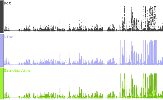
Graphs can be shown in various representational styles; the type of graph that is most appropriate depends on the type of question being asked about the data. For example, when comparing trends and patterns, it is very useful to use the line graph display method. The number of expression intervals being shown also can affect the graph display choice. The user is encouraged to experiment with the different display types to find out which method works best for specific purposes.
To change the graph style, select the graph track, then select the type of graph in the Style panel.

The following graph styles are available in IGB:
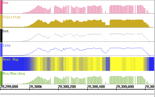
The following image illustrates how a single data set would look in each of the graph styles. The graph used for this image is a simple position graph. An example of an interval graph was given in the introduction to this chapter.

Note that with the heat map style for position graphs, the background (here in white) does not show through in regions where there are no data points. This is because the heat map first applies the stair-step function on the data before choosing colors to display. Compare the widths of the color bands in the heat map graph to those in the stair-step graph. For interval graphs displayed in the heat map style, the background will show through in regions with no data.
Due to the high zoom level in the above image, the Min/Max/Avg graph style is displayed exactly the same as the Bar style. When zoomed out, it reverts to showing the minimum, maximum and average values of all the data in the whole range of coordinates under each horizontal pixel width.

To change graph color, like changing graph style, select graph, then use the color boxes in the Style panel.
For graphs in the heat map style, the chosen color will only be used on graph labels and handles. The heatmap colors come from the chosen heat map.